
X-Ray your way to better dashboards: A framework for learning from great design
As dashboard developers, we’re in the trenches every day – building Power BI or Tableau reports, wrestling with calculations, adjusting layouts based on stakeholder feedback. We know the technical challenges: making slicers work smoothly, optimizing load times, cramming multiple metrics into limited screen space. But how often do we pause to really analyze what makes a dashboard work from a design perspective?
Most of us bookmark impressive dashboards or screenshot clever techniques, then never look at them again. We know good design when we see it, but we struggle to articulate why it works or how to apply those insights to our own projects.
That’s where dashboard X-Raying comes in.
The Dashboard X-Ray Method
Borrowed from data visualization analysis and the great Alli Torban, this technique forces you to systematically break down any dashboard into four key areas. When you encounter a dashboard that strikes you, whether it’s beautifully designed, surprisingly functional, or just different: take five minutes to X-ray it.
X- eXcited
What grabbed your attention first? Maybe it’s how they handled multiple KPIs without clutter, or an unexpected color palette that somehow makes sense, or the way they guided you through a complex story.
R – Rules
What best practices are they following? This is where your analytical mind shines. Notice the smart decisions or general visual hierarchy rules.
A – Anarchy
Where did they break conventional wisdom? The most innovative dashboards often bend or break traditional rules. Maybe they mixed chart types unconventionally, used bold colors that shouldn’t work but do, or structured navigation in a surprising way.
Y – You
How will you apply this to your work? This is the crucial step most people skip. Don’t just admire – extract actionable insights. „For executive dashboards, I’ll adapt this summary-to-detail pattern.“
Let’s see some examples for dashboards from the Power BI community gallery and keep the idea of X-Raying in mind.
Let's look at the X-Ray method in more detail
X – eXcited: What grabbed your attention first?
Maybe it’s how they handled multiple KPIs without clutter, or an unexpected color palette that somehow makes sense, or the way they guided you through a complex story. Here are some examples:
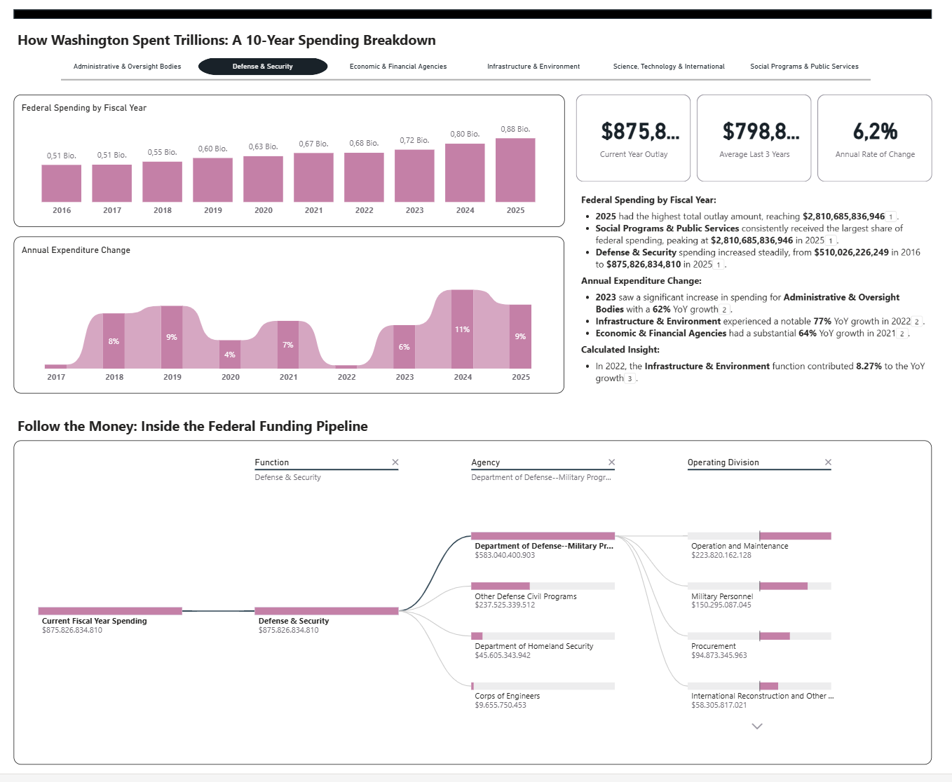
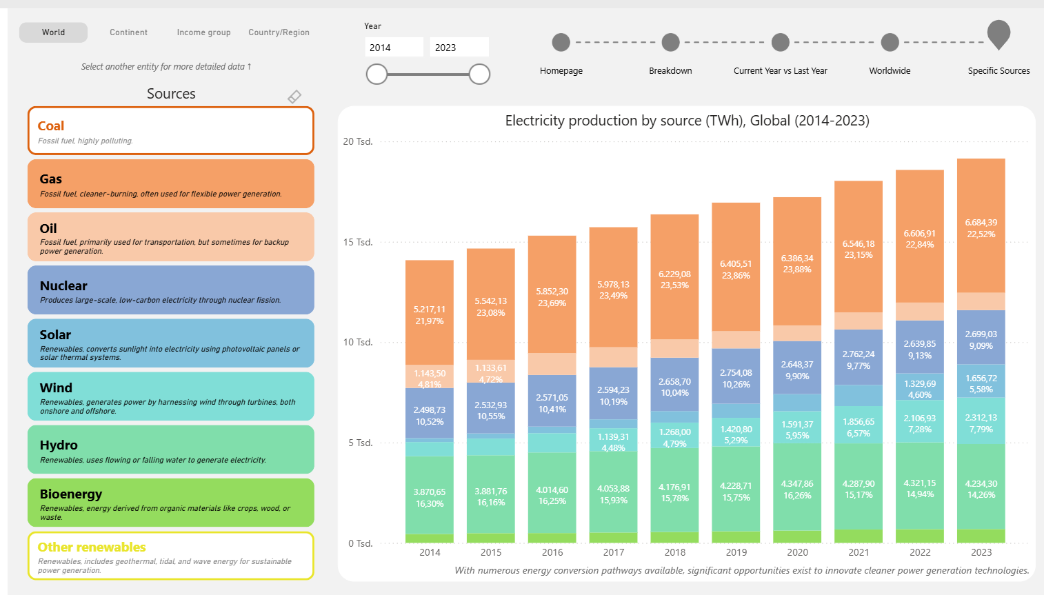
- Smart use of color coding – This energy dashboard uses intuitive colors (orange for fossil fuels, blues/greens for renewables) that immediately communicate meaning
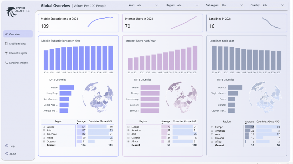
- Creative KPI card designs – Sparkline integration in KPI cards or clean reference sections in the KPI cards
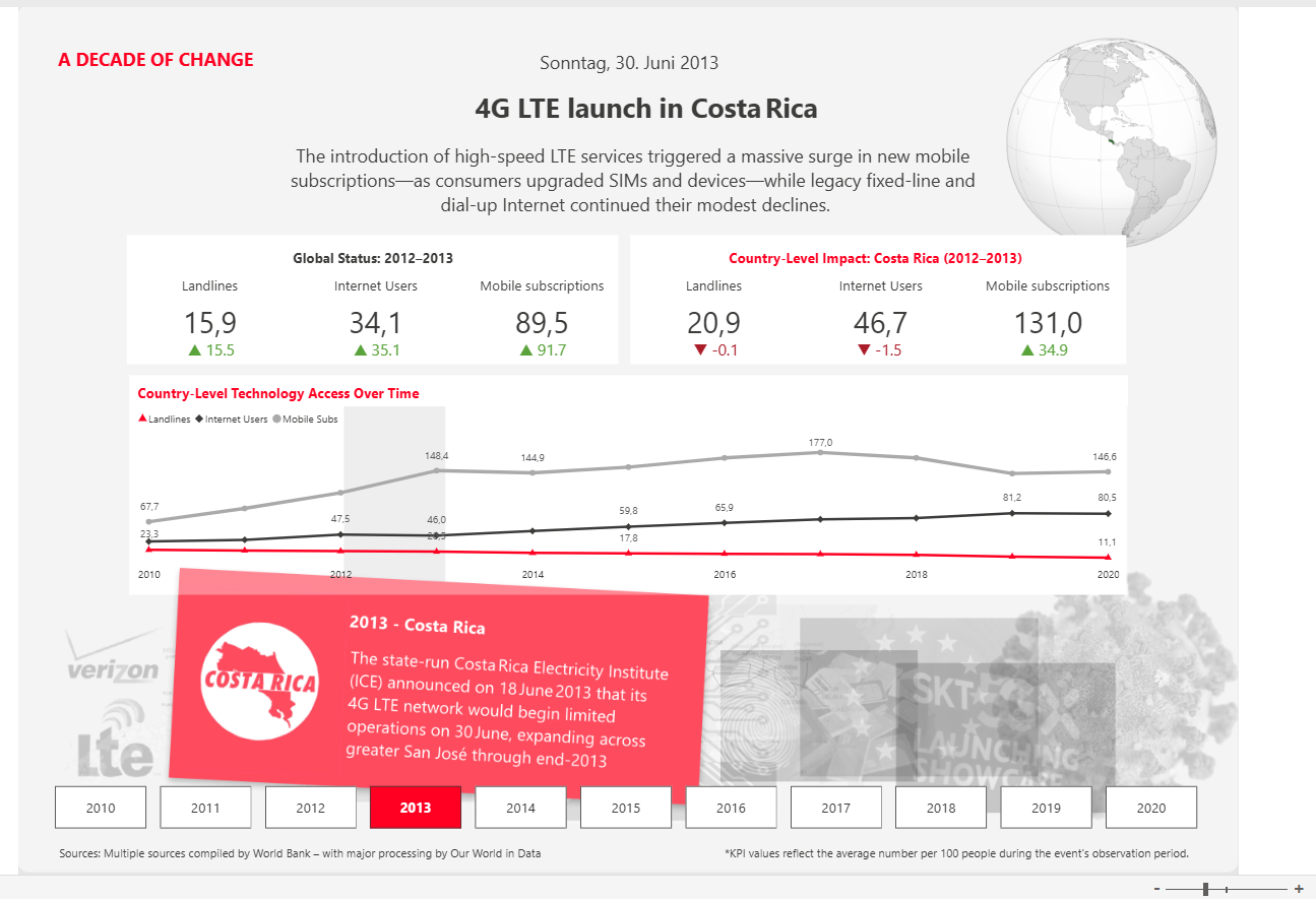
- Innovative chart combinations – A sankey diagram breaking down federal spending flows, or a timeline with event annotations
R – Rules: What best practices are they following?
This is where your analytical mind shines. Notice the smart decisions:
- Logical visual hierarchy – It is best to lead with key metrics, then provide supporting detail
- Consistent filter placement – Aligned filters for easy access
- Appropriate chart selection – Maps for geographic data, time series for trends, bars for comparisons
- Clean white space usage – Prevents visual clutter
- Color consistency within metrics – to maintain color themes throughout related visuals
A – Anarchy: Where did they break conventional wisdom?
The most innovative dashboards often bend or break traditional rules. Maybe they mixed chart types unconventionally, used bold colors that shouldn’t work but do, or structured navigation in a surprising way.
- Using sankey diagrams in business dashboards – A flow chart can be unconventional but perfect for budget breakdown
- Storytelling integration – You could embedd narrative text and event context directly in the dashboard
- Side navigation with detailed descriptions – In the enegery dashboard example the expandable energy source definitions break typical filter conventions
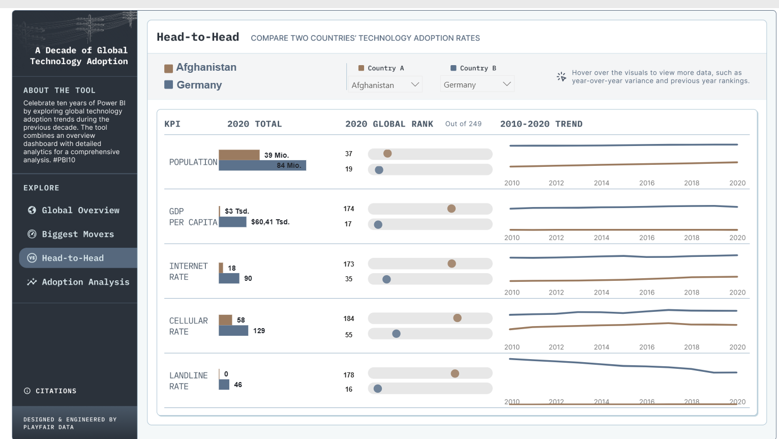
- Country comparison interfaces – A head-to-head setup treats dashboards more like interactive tools than static reports
Y – You: How will you apply this to your work?
This is the crucial step most people skip. Don’t just admire – extract actionable insights. „Next time I have quarterly data across multiple regions, I’ll try this drill-down approach“ or „For executive dashboards, I’ll adapt this summary-to-detail pattern.“ Other examples:
- Multi-metric executive dashboards: „When I need to show 3+ related KPIs, I’ll use the parallel column structure instead of cramming everything into one view“
- Budget/resource allocation reporting: „For showing how budgets flow through departments, I’ll adapt a sankey approach rather than just using pie charts“
- Time-based analysis with events: „When external events impact metrics, I’ll integrate timeline annotations“
- Comparative analysis tools: „For country/region comparisons, I’ll build a side-by-side structure with trend sparklines for context“
- Complex categorization scenarios: „When users need to understand category definitions, I’ll use an expandable sidebar approach instead of hiding info in tooltips“
Why This Works for Dashboard Analysis
Unlike static visualizations, dashboards are interactive experiences with multiple decision points. The X-ray method forces you to consider:
- User journey: How does the design guide exploration?
- Information architecture: How is complexity managed across multiple visuals?
- Interaction patterns: What makes the filtering and drilling intuitive?
Common Dashboard Design Challenges and How X-Ray Analysis Helps
Every dashboard developer faces the same recurring problems: stakeholders wanting „everything on one page,“ filters that break when users select unexpected combinations, and executives who can’t find the key insight buried in visual chaos. I’ve seen dashboards where users got lost clicking through endless drill-downs, and others where the most important KPI was overshadowed by flashy but meaningless charts.
Systematic analysis changes how you approach these challenges. When you X-ray successful dashboards, you start noticing the subtle design decisions that prevent these problems – how they use progressive disclosure to manage information overload, how they structure filters to avoid breaking interactions, and how they guide users toward insights rather than just displaying data. Instead of reinventing solutions for every project, you build a mental library of proven patterns. The five minutes you spend analyzing a well-designed dashboard can save hours of revisions when stakeholders inevitably ask „but can we also show…“ for the tenth time.
But don’t just analyze other people’s work. X-ray your own dashboards after they’ve been live for a few months. What initially excited you about the design? Which best practices are actually working in production? Where did you break conventional rules, and did those risks pay off? Most importantly, what would you do differently now? This retrospective analysis is where real growth happens. You’ll spot patterns in your own design evolution and identify techniques worth repeating in future projects.
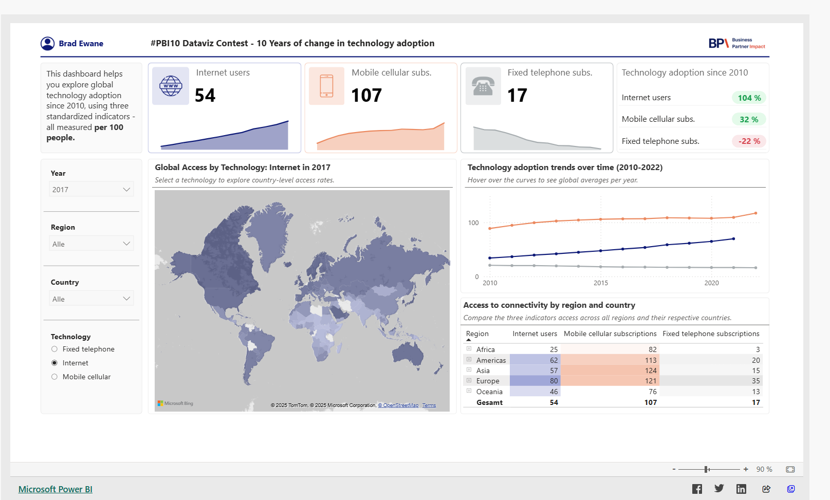
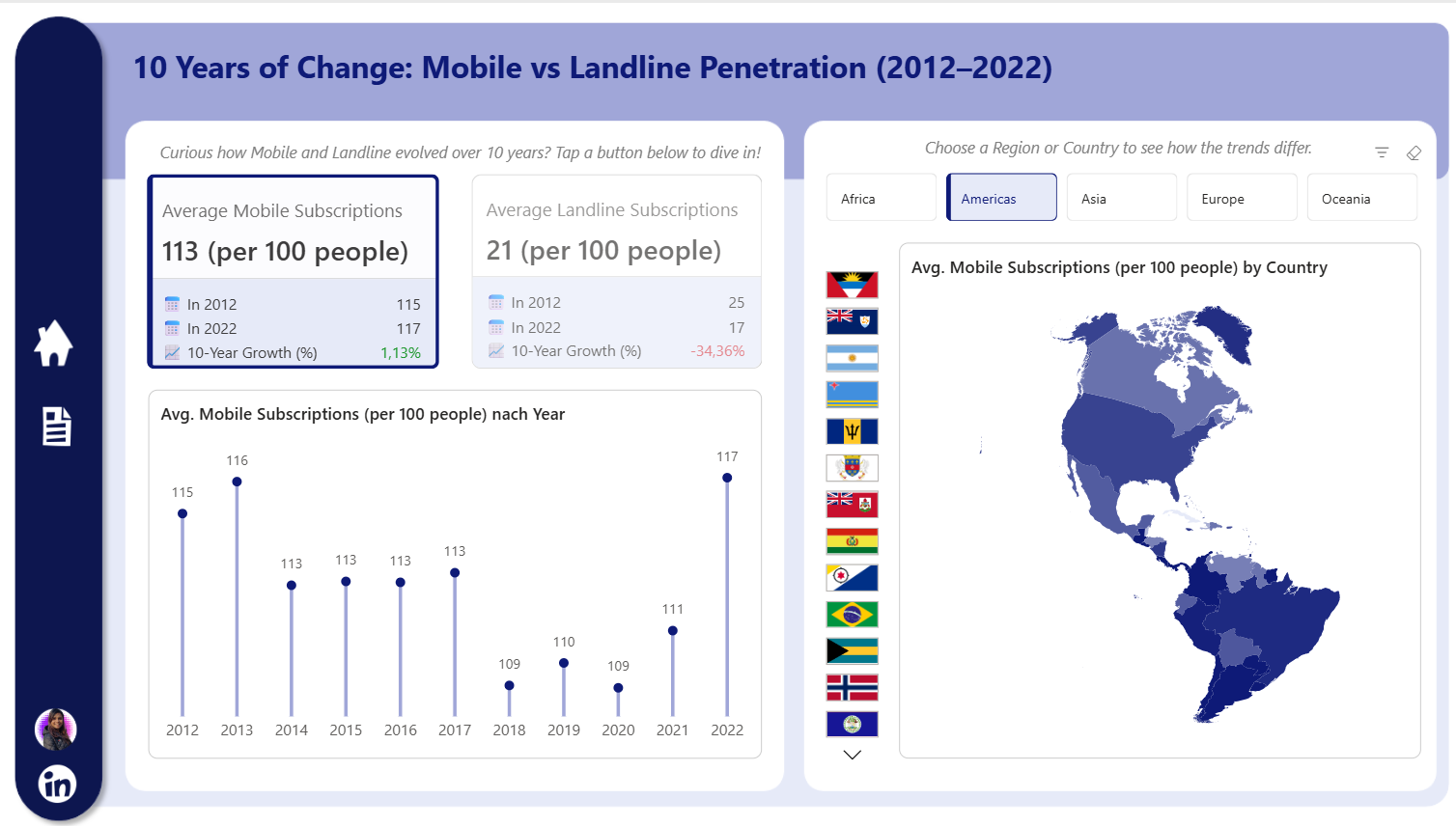
One detailed example
Let me walk through the X-ray method on this Analytics dashboard, which was published as an entry to the 10 Years of Power BI contest here.
X – eXcited
The three-column layout with consistent visual structure always catches my attention. Each metric (Mobile Subscriptions, Internet Users, Landlines) gets equal visual weight but uses distinct color palettes (blue, purple, gray-blue) that feel cohesive rather than chaotic. The way they paired sparklines in the KPI cards with full bar charts below creates a nice „summary-to-detail“ flow without feeling repetitive.
R – Rules
This dashboard follows several best practices beautifully:
- Consistent visual hierarchy: Each column follows identical structure (KPI card → bar chart → map → regional table)
- Appropriate chart types: Bar charts for time series, horizontal bars for rankings, choropleth maps for geographic data
- Clean white space: Generous padding between sections prevents visual clutter
- Logical filter placement: Year/Region/Sub-region/Country filters are positioned prominently at the top
- Color consistency: Each metric maintains its color throughout all visualizations
A – Anarchy
The most interesting rule-breaking choice: using three separate color palettes instead of a single brand palette. Conventional wisdom says „pick one color family,“ but here the blue/purple/gray distinction actually helps users mentally separate the three metrics. Also, they repeated the same layout three times (usually considered redundant) but it works because it enables easy comparison across metrics.
Y – You
Scenario for my work: When I need to compare multiple KPIs across the same dimensions (time, geography, categories), I’ll use this parallel column structure. Instead of cramming everything into a single view or forcing users to switch between tabs, I can give each metric its own column while maintaining identical visual patterns. This would be perfect for comparing sales metrics (revenue, units, margin) or operational metrics (efficiency, quality, cost) across regions and time periods as an overview.
Specific technique: For trend and geographic analysis, I’ll adopt this pattern: summary stat with sparkline → detailed trend → geographic breakdown → regional comparison table, all in one view. But I might use sparklines with a proper axis and add a reference number.
Building your own dashboard design library
Start small. X-ray one dashboard per week. Keep notes in a simple format:
I am currently using Obsidian to organize all my notes and I have a dedicated session for the X-Rays. First I include a separate page for each dashboard and then I also rearange my thoughs by area, so I have a continuously growing note for all „exitements“, „rules“ and so on.
After a few months, patterns emerge. You’ll develop a personal toolkit of design solutions for common problems: handling multiple metrics, designing for mobile, presenting time-series data, managing filter complexity.
Your Next Step
Find a dashboard that caught your attention this week – maybe one from your organization, a public example, or something from the Power BI community gallery.
Take five minutes and X-ray it. What excited you? What rules did they follow? Where did they break convention? And most importantly: how will you use what you learned?
The best dashboard designers aren’t just talented – they’re systematic learners.
Start building that systematic approach today!!